Your WooCommerce Store Must Be Responsive
Everyone has heard the buzzwords “responsive design” for years now. Yet I still come across WooCommerce stores that are not mobile ready. Big brands like State Farm publicly announced in 2013 that they received a 56% uptick in conversion when they switched to a responsive design. The numbers don’t lie, your WooCommerce Store must be responsive.
Consumers today use their smartphones throughout the entire shopping process from product research to price comparison, to purchasing. They want their shopping experience to be quick and simplified. To survive, brands must cater to this concept.
And yet, eCommerce stores employ a mobile-friendly design as an afterthought and not as the focus it should be. Mobile devices are a major factor in the majority of shoppers journey.
For mobile shoppers who make a purchase in a retail store, smartphones are constant companions and the in-store device of choice for most.
- En route to the store, 70 percent of smartphone shoppers use a store locator to plan their shopping trip.
- Once they arrive at the store, 37 percent stay organized using lists while shopping on their phones.
- Savvy mobile shoppers use their devices to check prices, and the majority of smartphone (63%) and tablet (53%) owners search and scan their way to savings, though more smartphone owners do this while in a retail store.
- And the savings continue in the checkout lane, where smartphone shoppers are more likely to use their devices for mobile coupons (34%) and for payment (23%).
You must choose a design that allows for your WooCommerce store to react to your audience that finds you online. Then, enable them to complete their purchase experience from their mobile devices.
Mobile visits account for 49 percent of holiday shopping visits. In 2015, over $514 million in sales was attributed to mobile devices — with $375 million coming from Apple devices.
How do you make your WooCommerce Store responsive to mobile devices?
You have a few options.
1. Start from the ground up.
Maybe your store is ready for a rebranding anyway and you have the budget to redo it all.
- You hire a web development agency to rebuild your site using WordPress and WooCommerce.
- They create a design for your site and make sure it is responsive.
- They will add the plugins that you need to make your store run smoothly.
- Deploy your site on Hostdedi since we are the trusted provider for WooCommerce stores.
This option will be your most expensive, but since you are already a trusted brand who wants an update it could work for you.
2. A template version.
If you have a tighter budget and some ability to take on the task yourself then this could be the option for you.
- Start with a WordPress install or choose a managed hosting option like Hostdedi and add WooCommerce.
- Use a template design like Storefront that is specifically designed for WooCommerce.
- Add the plugins you need to add the functionality your WooCommerce store requires.
- You do all the configurations and product add-ons. This is tougher but can save you a lot of money.
Choosing this option means you won’t have as much custom work on your store, but using a nice optimized template that you can add your own branding to can be a really great solution.
No matter the choice you make, one thing is clear. In order to have a WooCommerce store that actually converts for you, it must be mobile responsive.
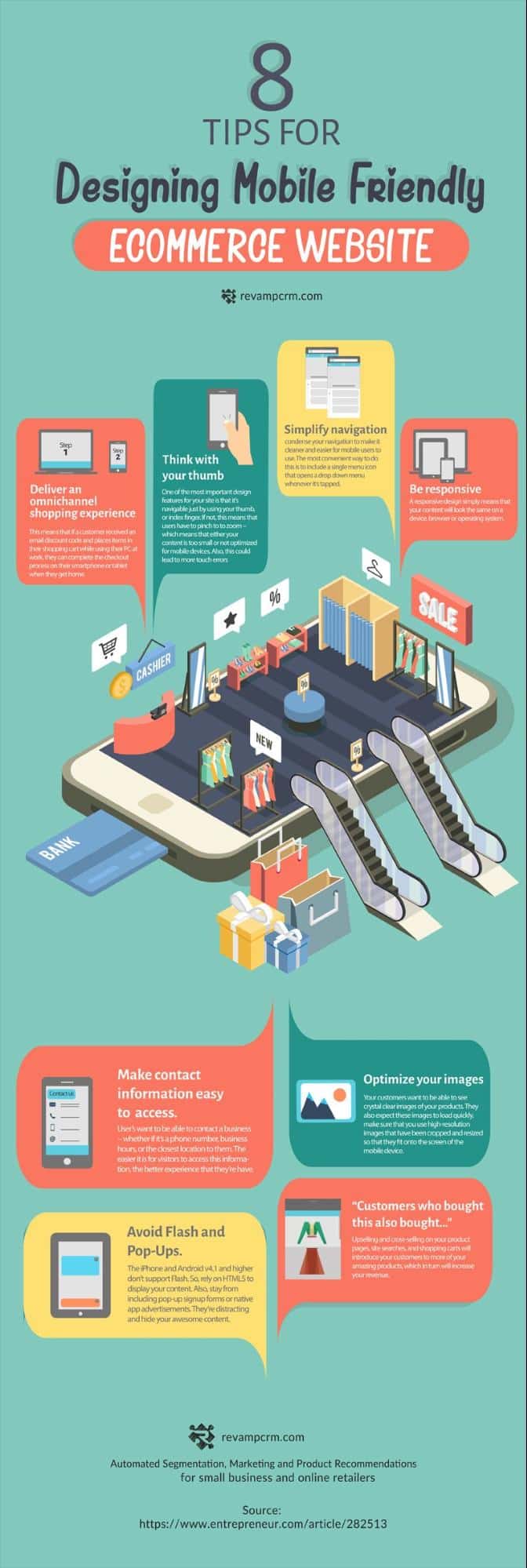
Here is a handy infographic I found that can help you in your process of changing your WooCommerce store to a responsive version.
We have launched our Managed WooCommerce Hosting solution. Click here to learn more about how to make your WooCommerce Store faster.