The Right Way To Handle Images For Retina Devices In WordPress
 We’re well into the era of high-definition displays. The term Retina is a bit of marketing-speak from Apple, but almost every smartphone and most tablets now offer screens with very high numbers of pixels crammed into a small space. Retina screens are still relatively uncommon on the desktop, but that’s likely to change — once again, Apple led the way here with the Retina MacBook Pro and now the Retina iMac.
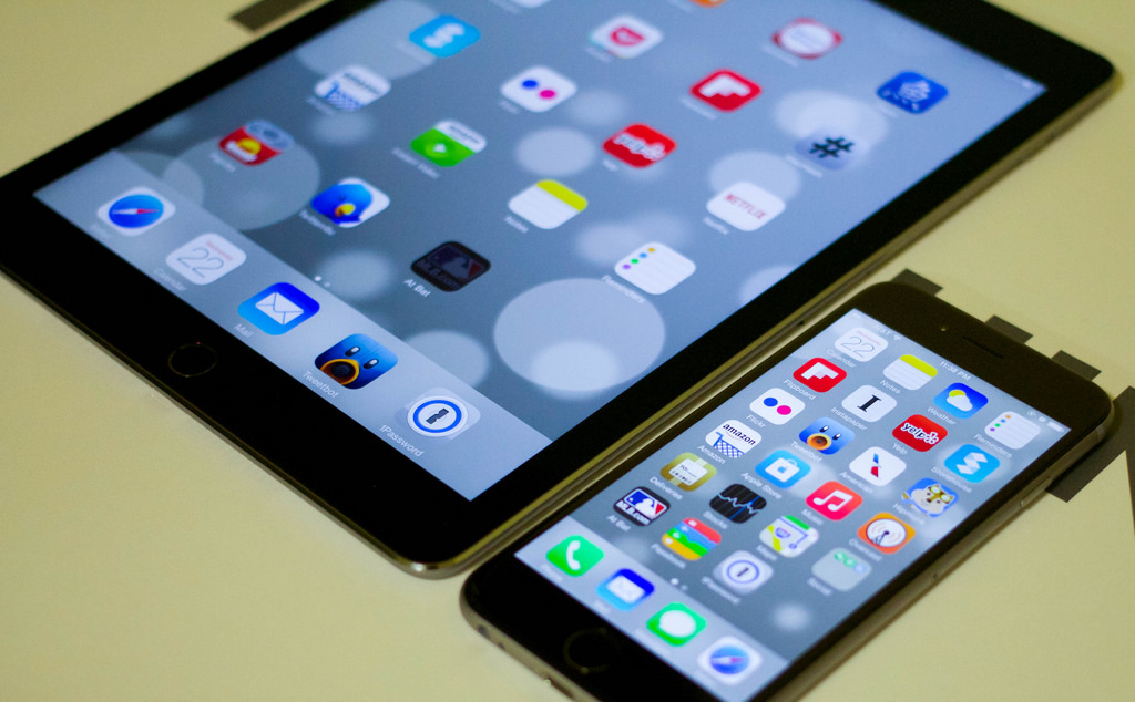
If you’ve ever looked at a site that hasn’t been optimized for Retina screens on an iPad or similar device, you’ll have noticed that images look blurry and pixelated. Many business site owners still haven’t gotten around to optimizing their sites for Retina, and given the popularity of high-DPI screens, that means their sites look bad to many of their visitors. In this article, I’d like to take a look at why unoptimized images look bad, and what WordPress site users can do to accommodate modern displays.
What Is A Retina Screen?
The technology and terminology of modern displays is complex, but it’s enough to understand that a physical pixel is a small illuminated dot. A modern display contains many hundred of thousands of these dots. The iPad Air 2 has a display with a resolution of 2048 pixels by 1536. It’s 9.7 inches across diagonally, which means that the display contains 264 pixels per inch — many more than non-retina devices, and therein lies the problem.
Imagine a web page featuring an image that is sized in CSS at 200 pixels square. That looks fine on a standard desktop display, but if it is displayed on an iPad with the CSS pixels translated into physical pixels, the image would be tiny — and so would everything else on the display. In fact, the pixels in CSS are not translated directly into physical pixels on the display. CSS pixels are device independent pixels: they are displayed differently by different devices.
In the case of the iPad, the number of physical pixels used may be double the number of CSS pixels: our 200 px square image would take up 400 physical pixels along its edges on a Retina screen. The number of pixels used is doubled, but there is no extra information in the image, and so the same thing happens as when we zoom in on an image — it gets fuzzy and pixelated.
To avoid poor quality graphics on Retina images, we have to provide 2x (or even 3x) images that have double the resolution we indicate in CSS — that way, they look good whichever screen size they appear on.
Retina Images On WordPress
This can be done manually in CSS using media queries and other techniques, but you’ll be happy to learn there’s a WordPress plugin that will do it for you. WP Retina 2x will generate all the necessary images and insert the required code into your WordPress pages so that the retina images are used when appropriate. For the most part, it should just work, but if it doesn’t there’s an excellent tutorial and FAQ.