Three Of The Best Data Visualization Tools For WordPress
 Data visualization and data journalism are becoming increasingly important to the modern media landscape. More data is available for public analysis than ever before. Data-focused journalists like Nate Silver and Ezra Klein have made a name for themselves with reporting based on hard-nosed analysis of empirical data sets. Both are in the early stages of establishing new media outlets, FiveThirtyEight and Vox respectively, that promise to take a different approach to reporting from traditional media.
The massive availability of data is a great opportunity for bloggers and businesses to delve into serious analysis, but making the most of data journalism involves data visualization. No one want to pore through massive tables of data and walls of dry text.
Visual representations are more user-friendly and better conform to the way people absorb information. Of course, infographics have been around for a long time — long enough to have become somewhat devalued by overuse in inappropriate contexts. In this article I’d like to get back to basics and highlight three of the best data visualization tools for bringing charts, graphs, tables, and maps to WordPress.
WordPress Charts
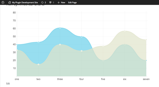
WordPress Charts brings the power of the excellent chart.js tool to WordPress. It’s probably the easiest way to create and embed beautiful, lightweight charts into WordPress posts and pages. The plugin supports six chart types, including line charts, bar charts, radar charts, pie charts, polar area charts, and donut charts. WordPress Charts is easy to use, and if you’re just getting started with data visualization, it’s perfect for creating elegant HTML5 charts without a steep learning curve.
Visualizer
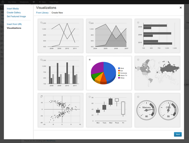
Visualizer is somewhat similar in functionality to WordPress Charts, but under the hood it uses the Google Visualization API rather than charts.js. Visualizer offers a slightly wider range of charting option than WordPress Charts, adding geo charts, gauge charts, and candlestick charts to the list.
There are other plugins that make use of Google’s charting tools, but I’ve chosen to highlight this one because the others have not been brought up-to-date with the most recent version of WordPress.
Google Fusion Tables
[code]
src=”https://www.google.com/fusiontables/embedviz?q=select+col12+from+1-
941Px73b_XWWn3pmPHKp6WhbbSVNiEmKMadwe0&viz=MAP&h=false&lat=10.9550118334641
48&lng=-85.47234208496099&t=1&z=11&l=col12&y=45&tmplt=51&hml=TWO_COL_LAT_LN
G”>[/code]
Part of Google Drive, Google Fusion Tables are an extremely powerful data visualization tool. Designed to facilitate the combination of data from multiple sources, Google Fusion Table are more complex than the previous suggestions I’ve made, but also more capable.
The map at the top of this section was created from example data provided by Google, and it shows some of the power that Fusion Tables provide, particularly when combined with Google’s maps. Google Fusion tables are heavily used by major publishers like The Guardian for its data journalism.
Unlike the other suggestions I’ve made in this article, there is no direct integration between Google Fusion Tables and WordPress, but it’s possible to publish visualizations using embed codes.
Whether you want to publish a couple of pie charts or an in-depth mashup of data from multiple sources, WordPress has you covered.