Four Steps To An Improved WordPress UX

User experience design is not easy, but WordPress users aren’t starting from scratch. WordPress provides the bones of a site with great UX and the tools to flesh out those bones with logically organized content.
Declutter The Pages
For business sites in particular, there is a pressure to embellish the homepage with as much content as can be squeezed into the space. Modern site design tends towards long scrolling pages with discrete units arranged vertically, so there’s less of the “cram everything above the fold” aesthetic that plagued earlier sites. But it’s still easy to find sites that have too much text, too many widgets, and too little organization.
It’s best to think of each page as having a job to do. For the homepage, it’s branding and an introduction to the products or services the site offers. For blog pages, it’s the presentation of content. If we take a look at the Dropbox homepage we can see simplicity at work.
The designers take advantage of white space and provide simple snippets of text with relevant images to demonstrate why a lead might choose to sign up.
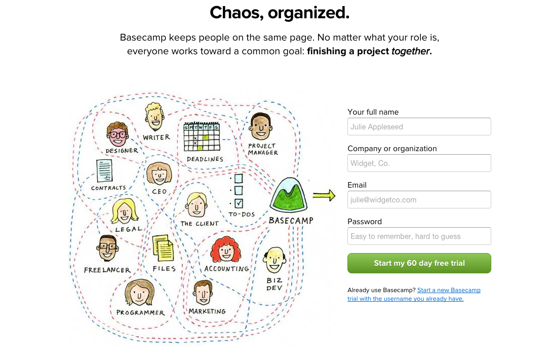
Basecamp’s homepage evinces a similar clarity of purpose: short effective copy, illustrative images, and a prominent contact box with a clear call to action.
Simple Navigation With Shallow Information Architecture
Designing navigation menus requires a careful balance between too many options and too few. With too many, the user has a difficult time finding what they want. With too few, what they want may not be there at all. Sites should have a logical hierarchical structure from which menu items can be developed naturally. If you find your menus are cluttered, it may well be time to rethink the site’s basic information architecture.
There’s a rule of thumb for designing website information architecture — no page should be more than three links away from the homepage. For publishing sites in particular, the homepage has decreasing importance: most visitors will arrive at internal pages directly from social media or search. But even for these sites it’s important that the journey from general to specific doesn’t become tangled.
In short, keep it as simple as possible.
Improve Search
WordPress has built-in search, and it’s better than it used to be, but it’s not a patch on users’ everyday experience of Google and other search engines. Search is an important navigational tool. There are several plugins that improve on WordPress’ default search options.
Among the best are Relevanssi and Search Everything.
Refined Typography
Video and images are a crucial part of the modern web, but text still forms the bedrock on which positive user experiences are built. Text should above-all be readable. Achieving optimal readability is no easy task, and it’s possible to go a long way down the typographic rabbit hole, but it doesn’t take much to create reading experiences better than the majority of the web.
There are books on the subject of web typography, but Matthew Butterick’s Typography In Ten Minutes is a great place to start.


